Wally Waffle
Menu Redesign
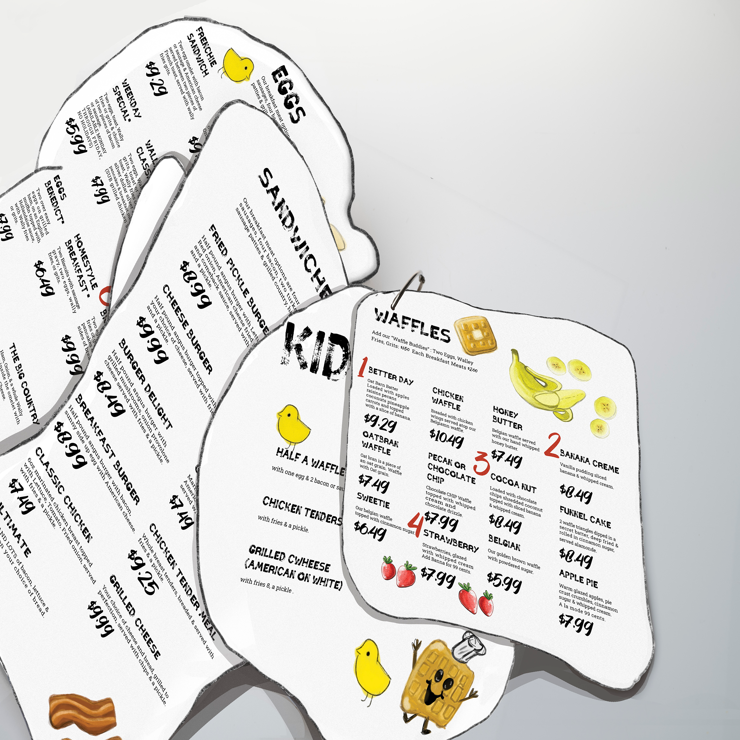
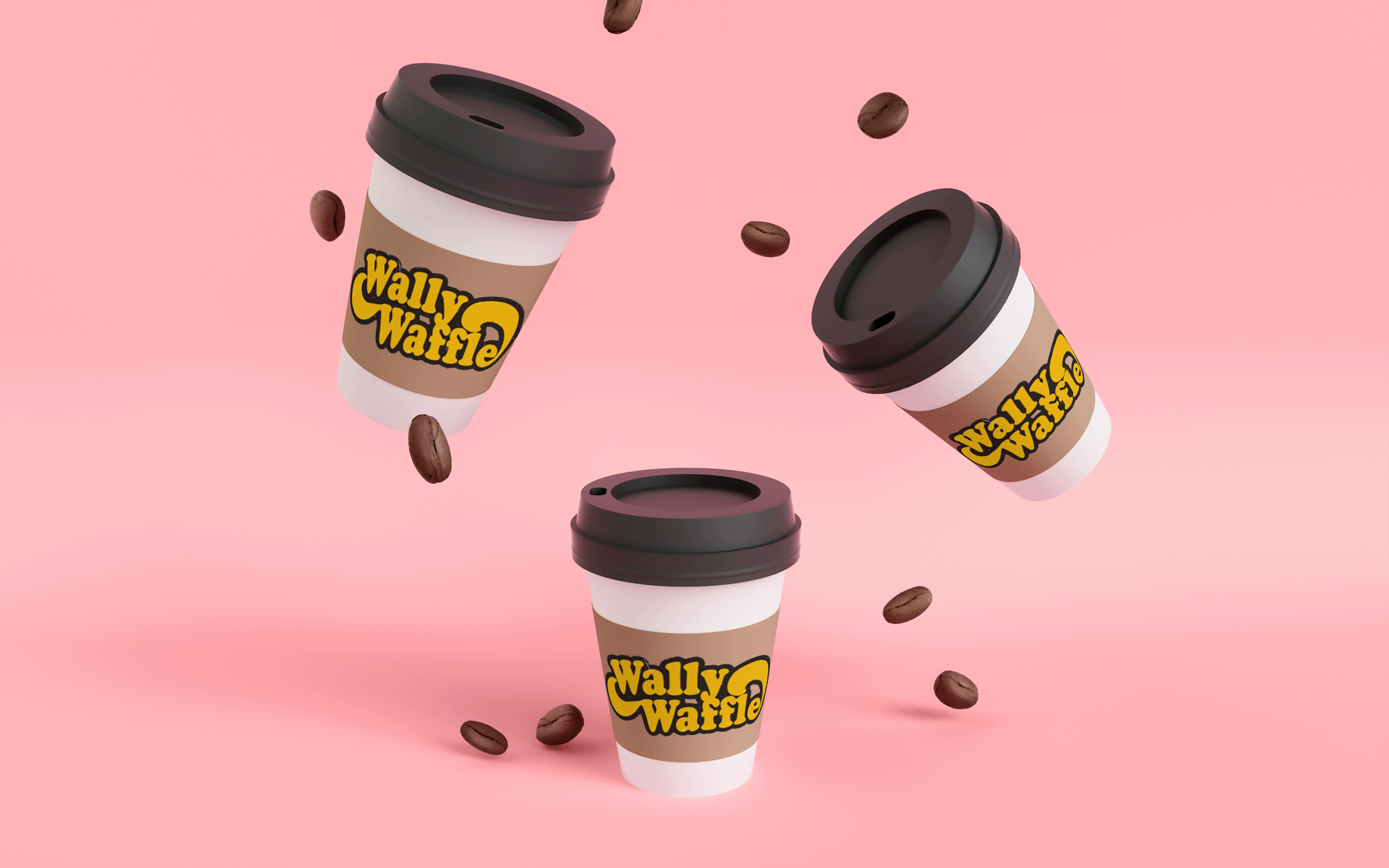
When redesigning the locally famous breakfast joint based in Akron, Ohio, Wally Waffle. The main focus was to keep the restaurant’s use of playful language and charming character. When it comes to a family-friendly restaurant using bright colors and endearing typefaces was always a key aspect. Not only did I redesign the menu to be cut-outs of large breakfast items. But I also added a magic 8 Ball quality to the menu. When a customer has trouble figuring out what they would like to order they simply shake the egg yolk, filled with water and yellow baking glitter, for the die inside to decide from the top 6 most ordered entrees at the franchise. To make this happen I used the Maker Space Lab at my school, the University of Akron Myer’s School of Art. Once the menu was designed I created illustrations to further the branding and marketing. Using the bright colors and friendly illustrations provided content for new merchandise including; mugs, stickers, pins, shirts, and social media ads. I went on to use the style from the illustrations and menu to design to-go boxes for leftovers. Using a traditional Pizza box cardboard die line, I designed leftover boxes to resemble waffles. That way customers can leave with a stack of waffles with the restaurant’s famous logo clear to see. This creates an opportunity for free advertising as well as helping the environment by switching from styrofoam boxes to recyclable cardboard.
Illustrations
I made sure to keep the illustration style to children friendly and use vibrant colors. The illustrations have a painterly style with some playful strokes clear to be seen while also using contrasting shades. The illustrations were fun to make and hard to choose for final compositions. I was even able to use some of the illustrations to create stickers that have proved to be very popular with breakfast fanatics. For the stickers please view my Depop!
Build Out
Creating the physical menu proved to be difficult but very successful for the final product. Each menu was made of thin pine wood that was painted with a dark stain. Each menu was laser cut out of the thin pine wood using the laser printer at Myer’s school of art. A hole was then drilled in each piece and a metal ring was used to hold them all together. The First menu and egg were created using two pieces of wood that held the vacuum-sealed plastic bowl sealed. I used an intense heat gun to seal the plastic after putting the die, water, yellow food dye, and baking glitter into the “yolk” bowl. Once the wood was sealed and glued, I then added an equally sized print of the illustrations to seal on top. With some of the menus this was successful, but due to glue and drying some were not. I used photoshop to overlay the illustrations on the photos I had taken in a created set to display the menu. Using 3D photoshop effects I was able to lay the menus on the photos of the bare menus successfully and clean up the others for the best presentation I could create.
Digital Applications


